Mentorship Platform for High-School Students
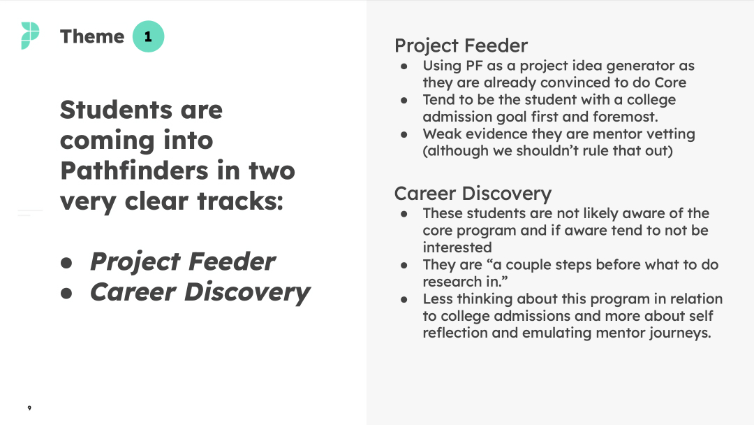
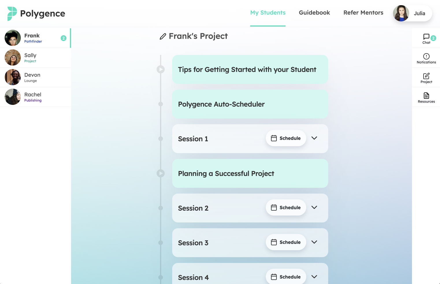
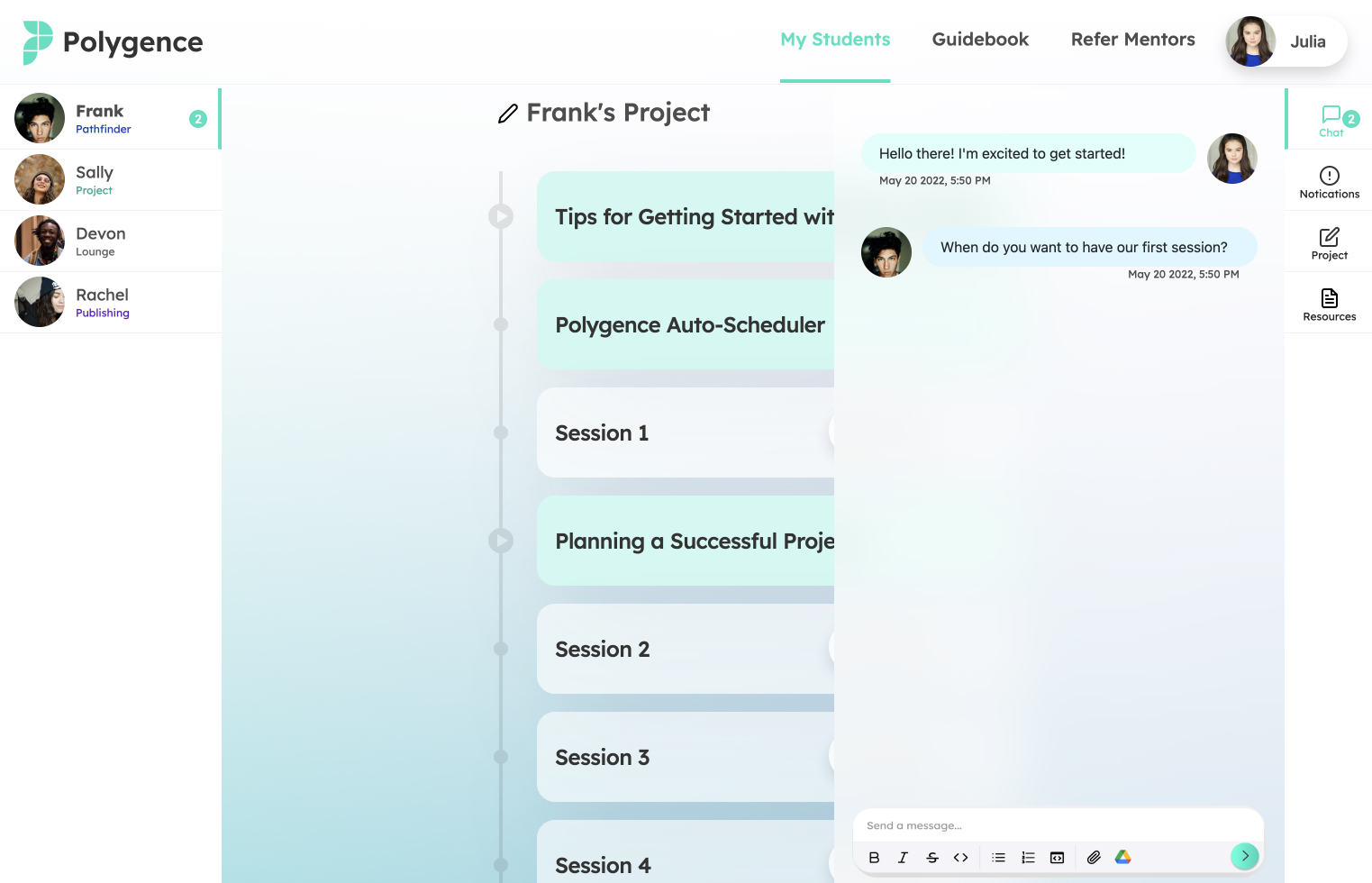
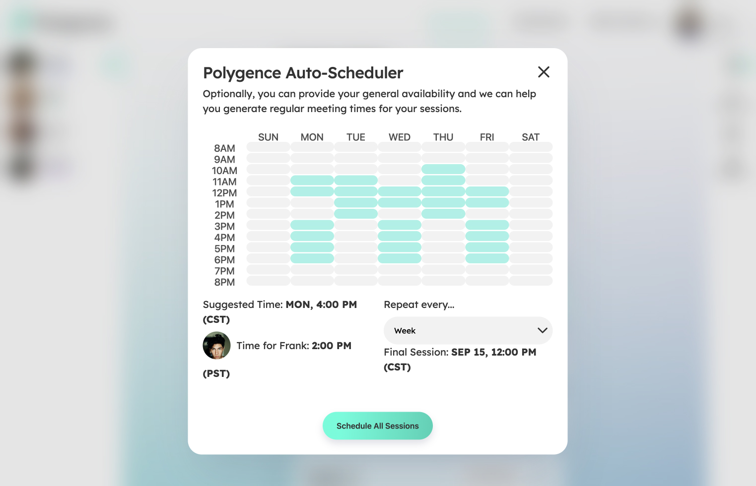
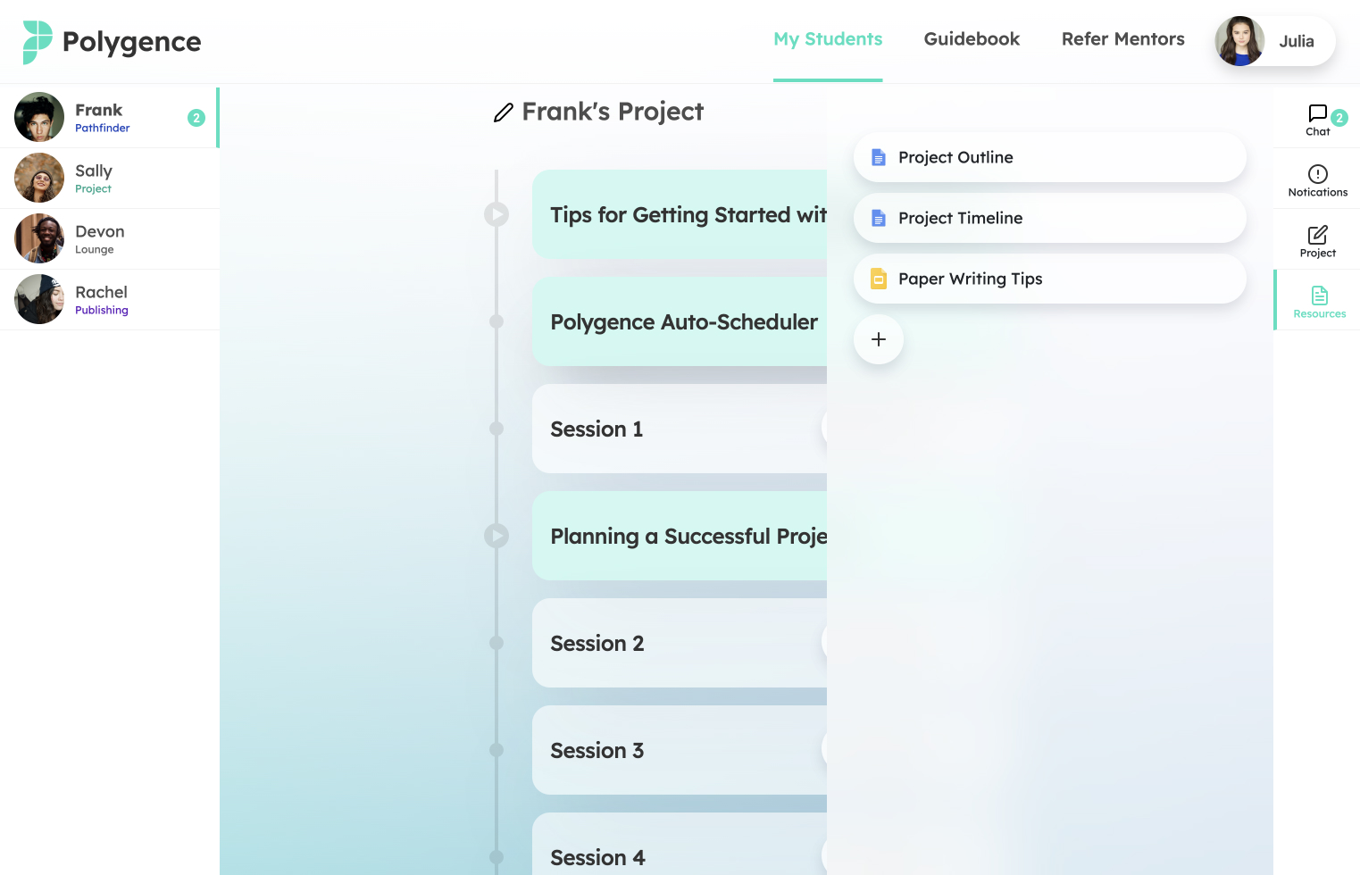
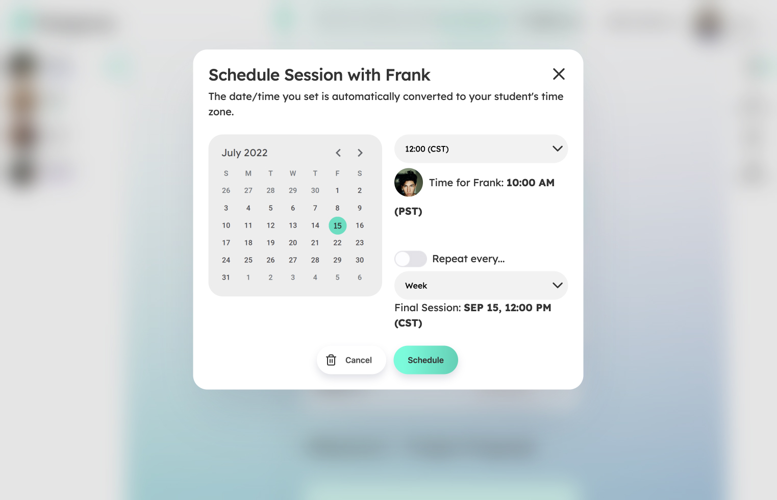
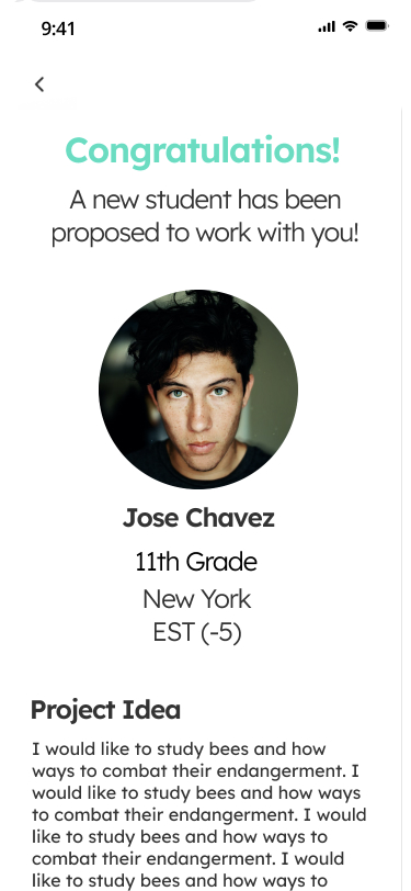
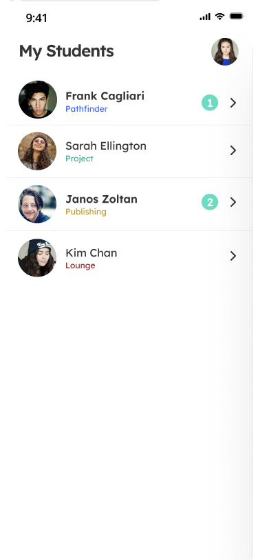
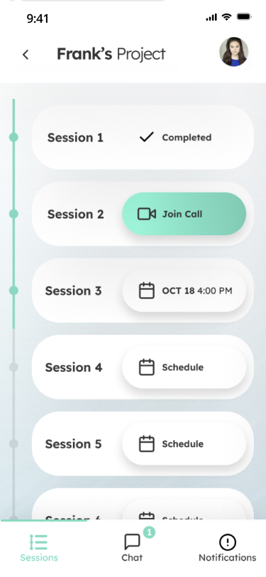
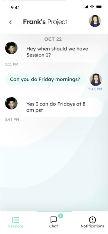
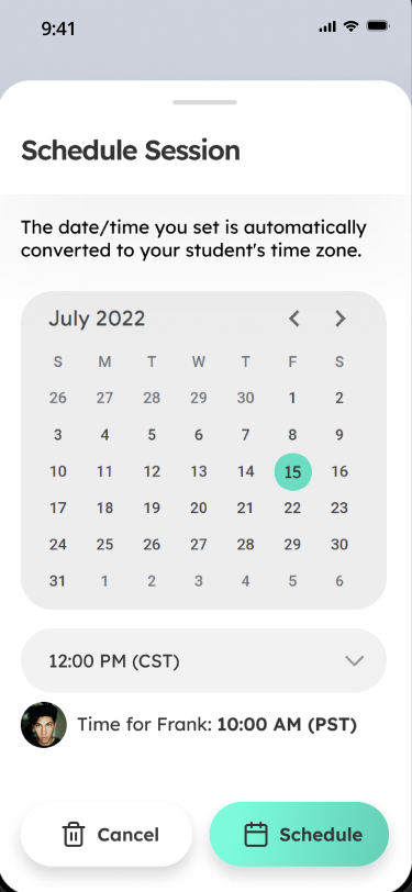
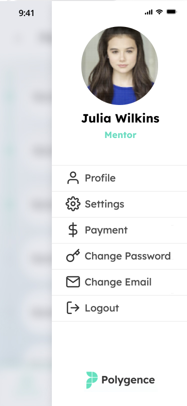
This case study details the product design of Polygence, a mentorship platform primarily for high school students. Polygence connects students to mentors using their interests and a proprietary algorithm. In the platform, students can message their mentor, share resources, and schedule new sessions. Students typically conduct a research project that helps them with college admissions.
MY ROLE
- UX Research
- UX Design
- UI Design
- Product Design
- Prototyping (Figma + HTML/CSS/JS)
COLLABORATORS
- Emma Leyden
- Claire Jung
- Angie Vadas
ACCOMPLISHMENTS
- Led UX and product design at the startup.
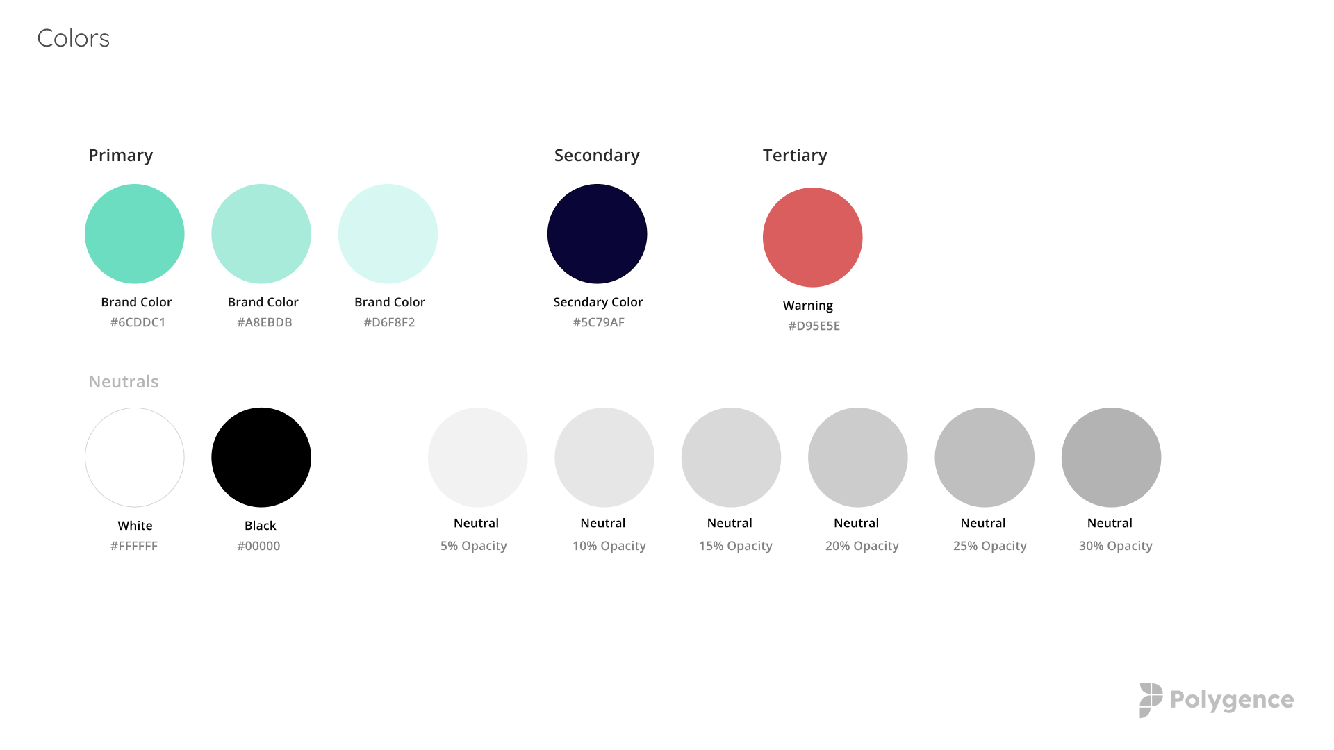
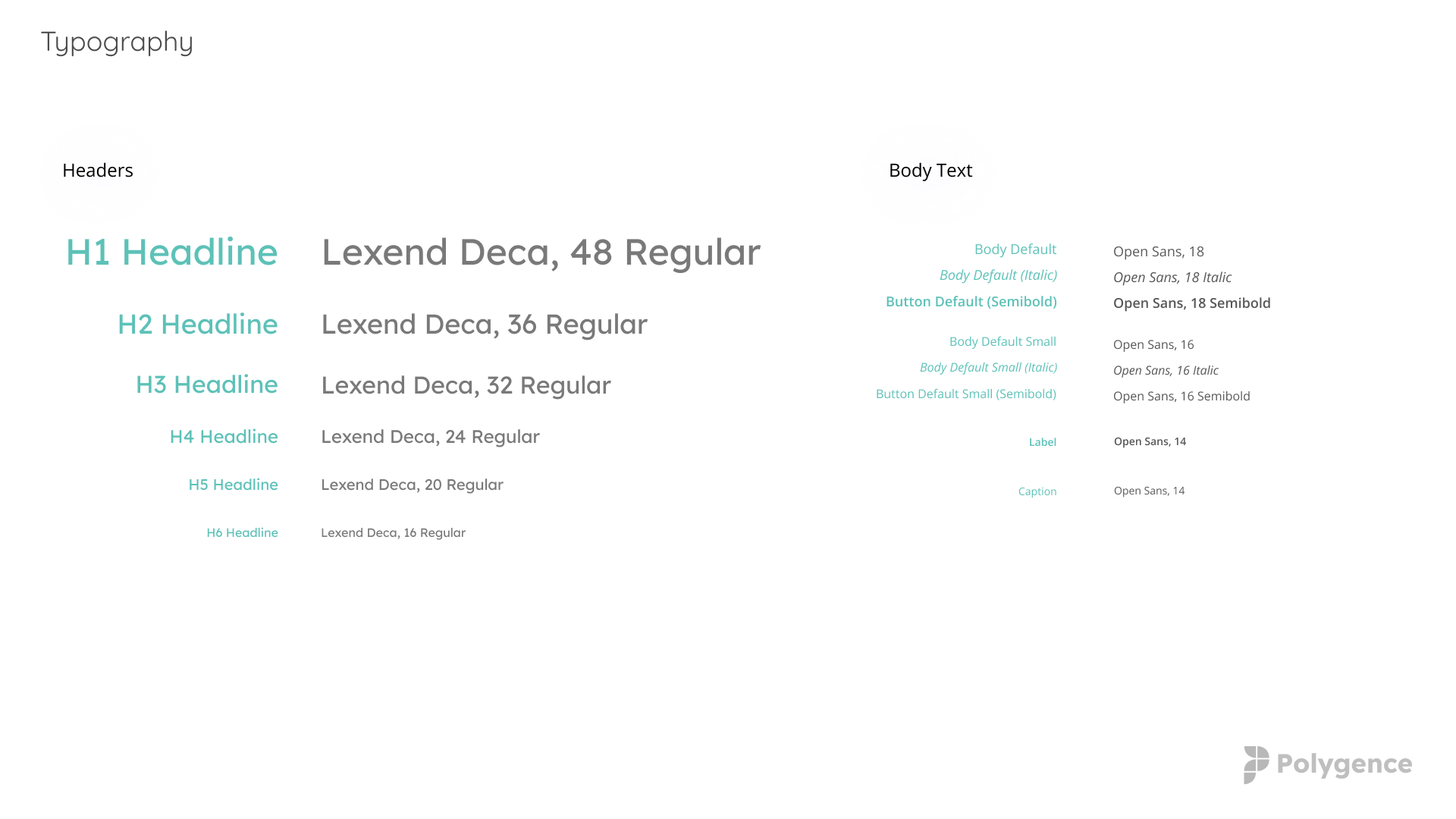
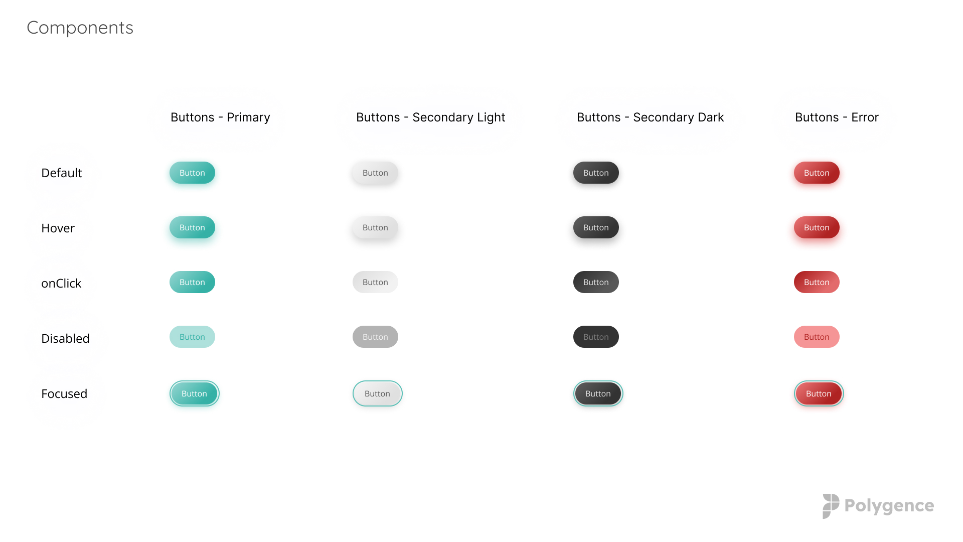
- Facilitated a rebranding and visual refresh of website, web app, and native app leading to a more consistent and cohesive brand identity and design system.
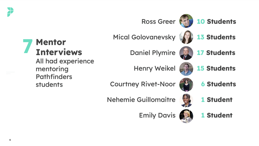
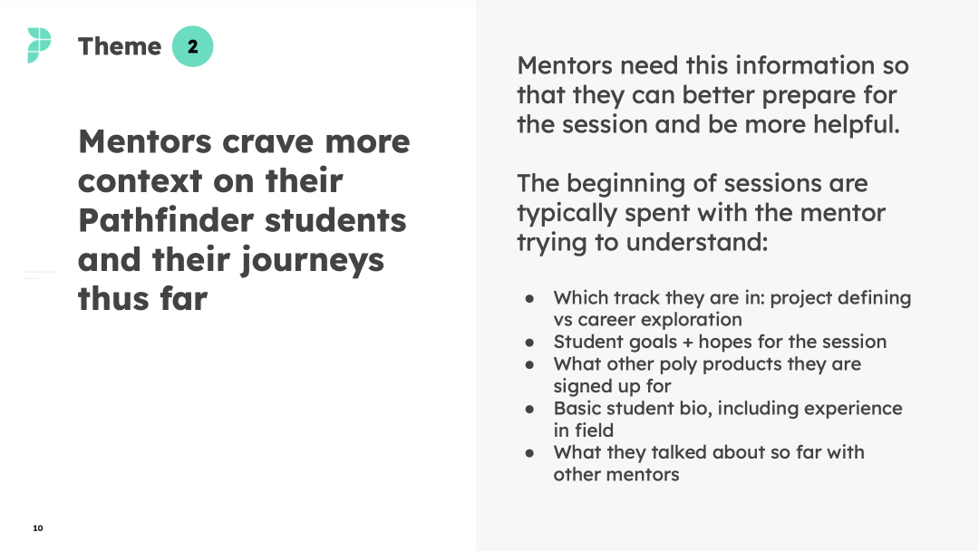
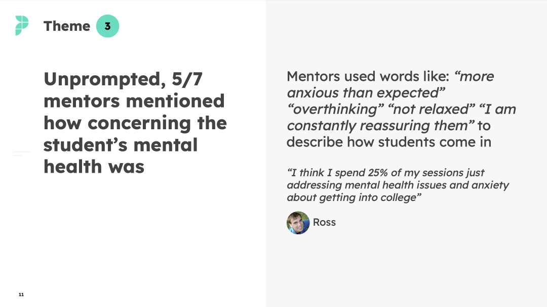
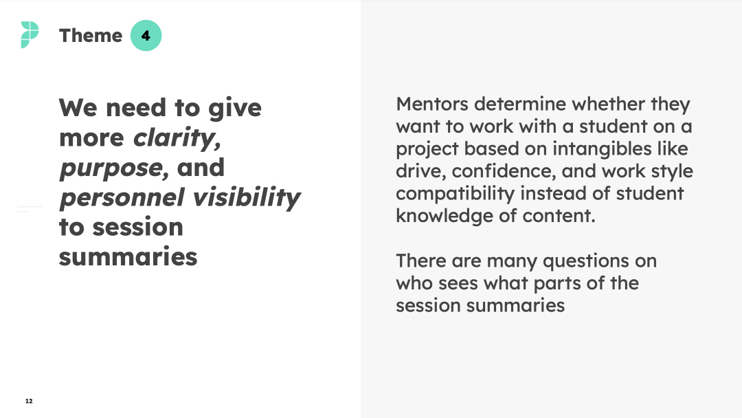
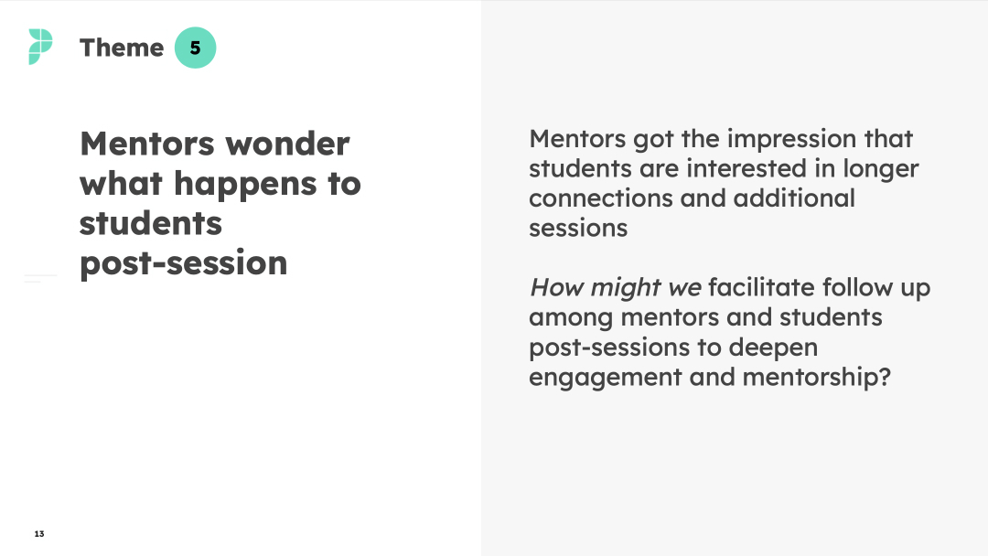
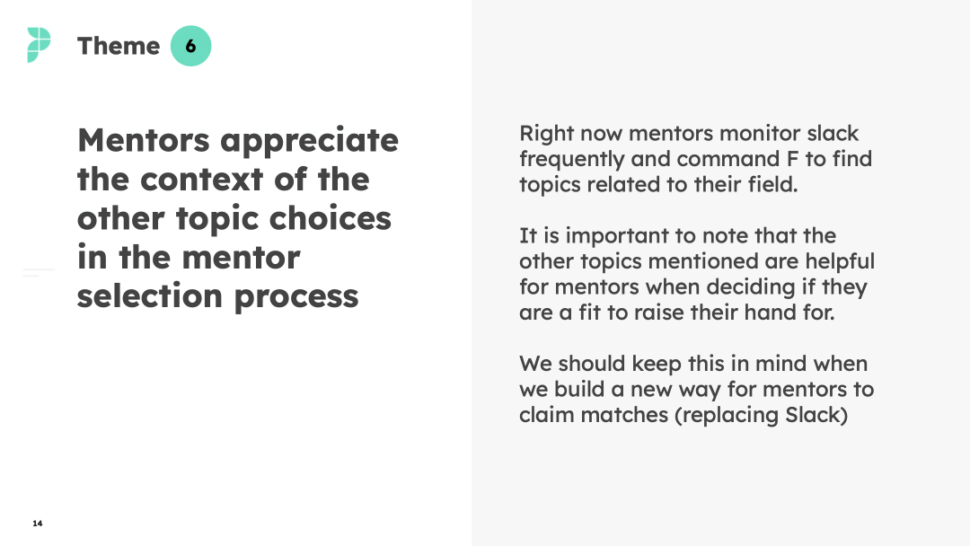
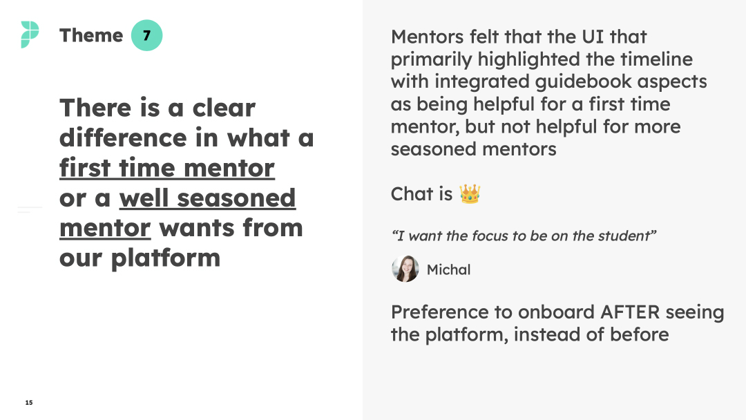
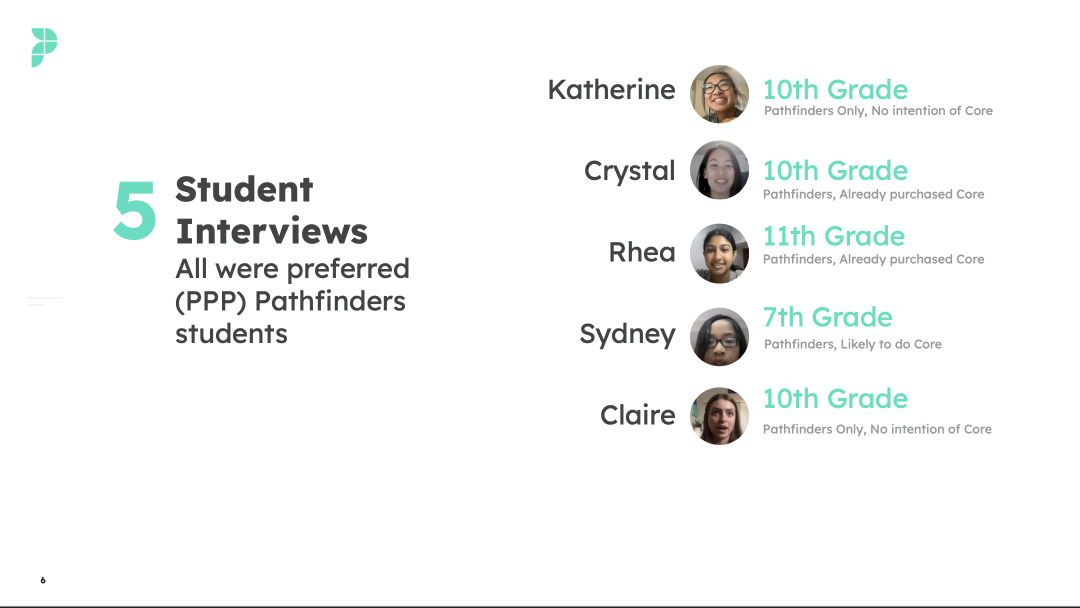
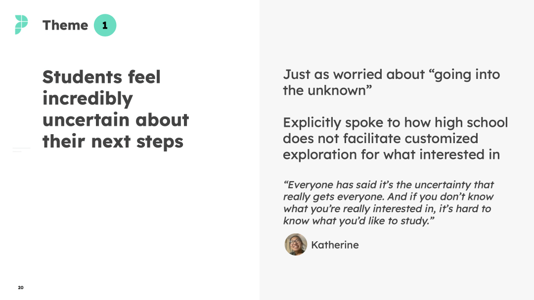
- Conducted interviews and usability testing with dozens of mentors and students providing a strong foundation for continued design work.
- Designed and facilitated numerous shipped features to create a world-class passion project experience for mentors and students, including tools for sharing resources, scheduling sessions, and a brand new native app (4.7 Rating on App Store).
- Mentored 2 mid-level designers on design best practices, more consistent design, responsive design, etc.
- Top-of-funnel improvements led to over $1 million in monthly revenue from student projects
- Company has helped more than 2400 students from 44+ countries do passion projects and get in to top-tier universities.
